Palma Ceia G&CC 1926 Georgian – Before & After
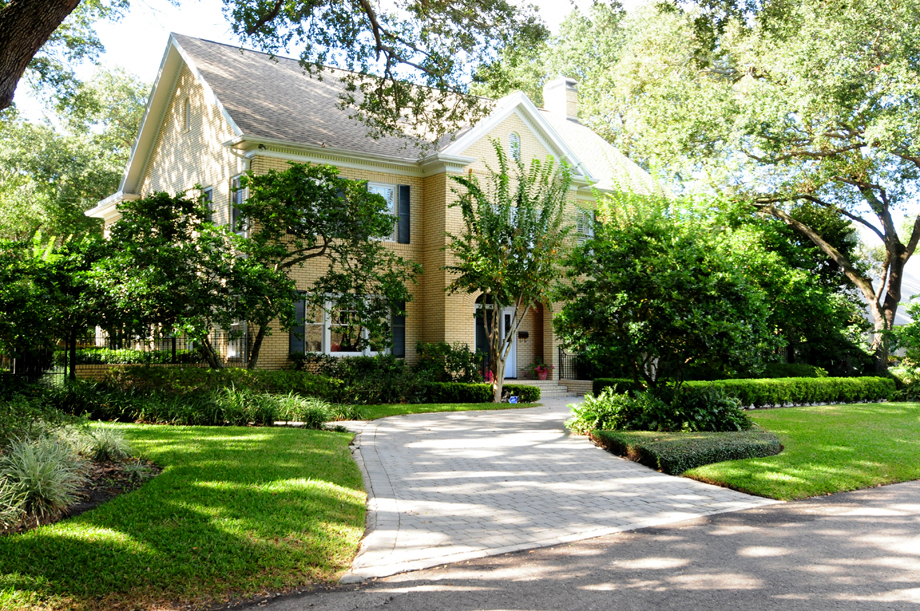
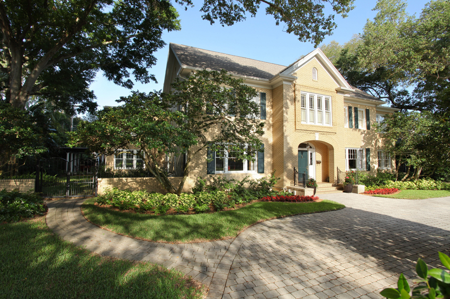
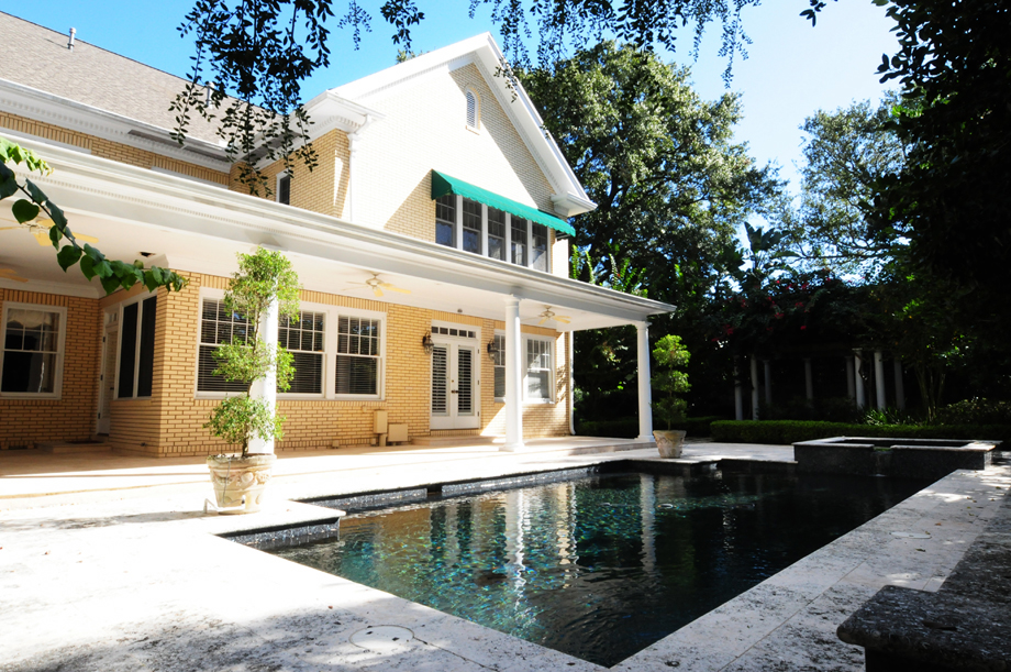
SOUTHEAST ELEVATION
BEFORE: This 1926 Georgian-style home had good bones. While the homeowners need more family space, they insisted on respecting the classic architecture with any modifications.
AFTER: One of the seamless two-story additions is visible on the left, a breakfast room below and office above. The second-story windows above the entrance have been raised up higher. See the new courses of brick? Blends well! Check out the Master Bath for the details.
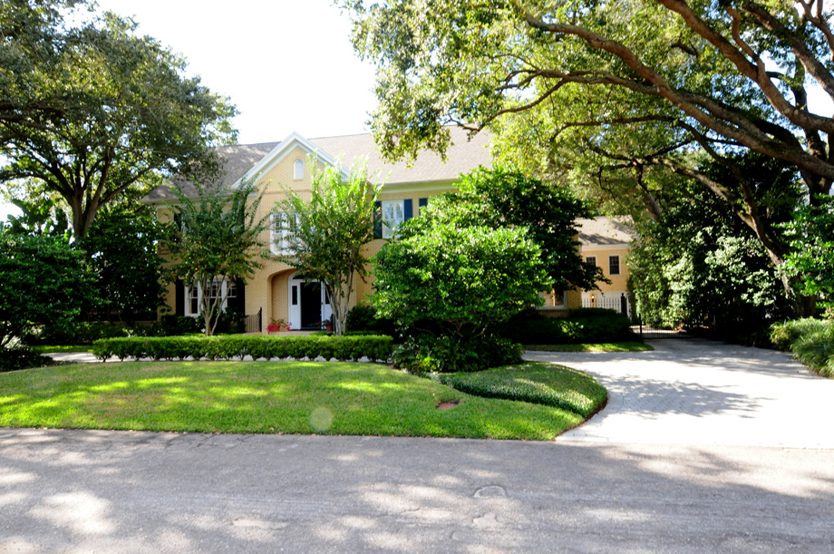
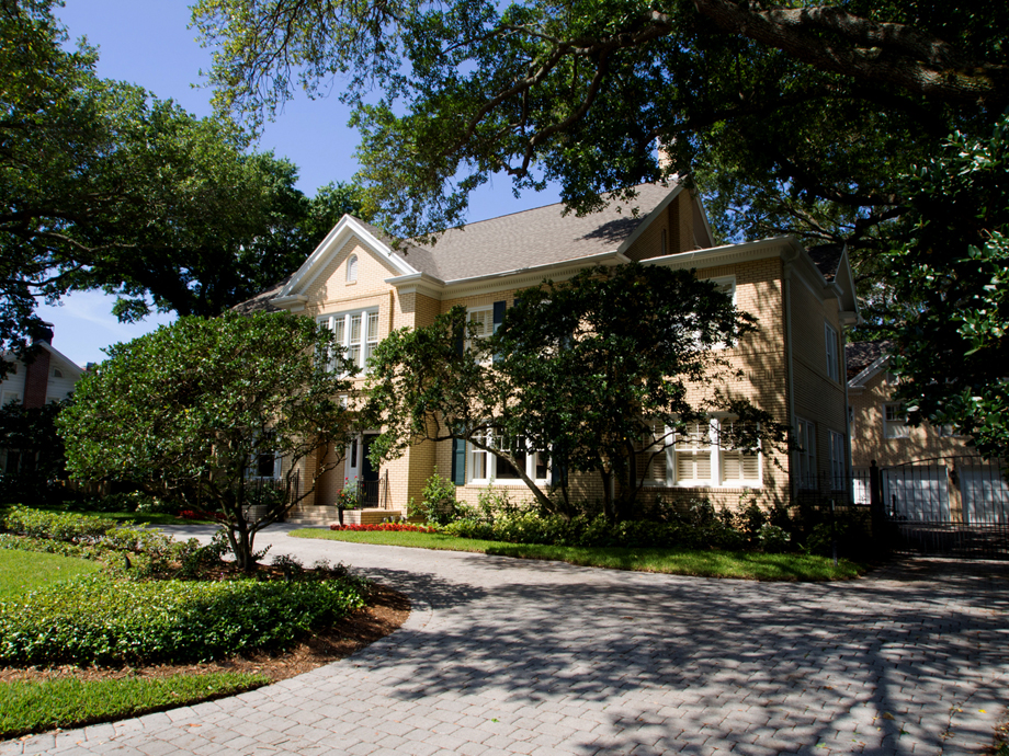
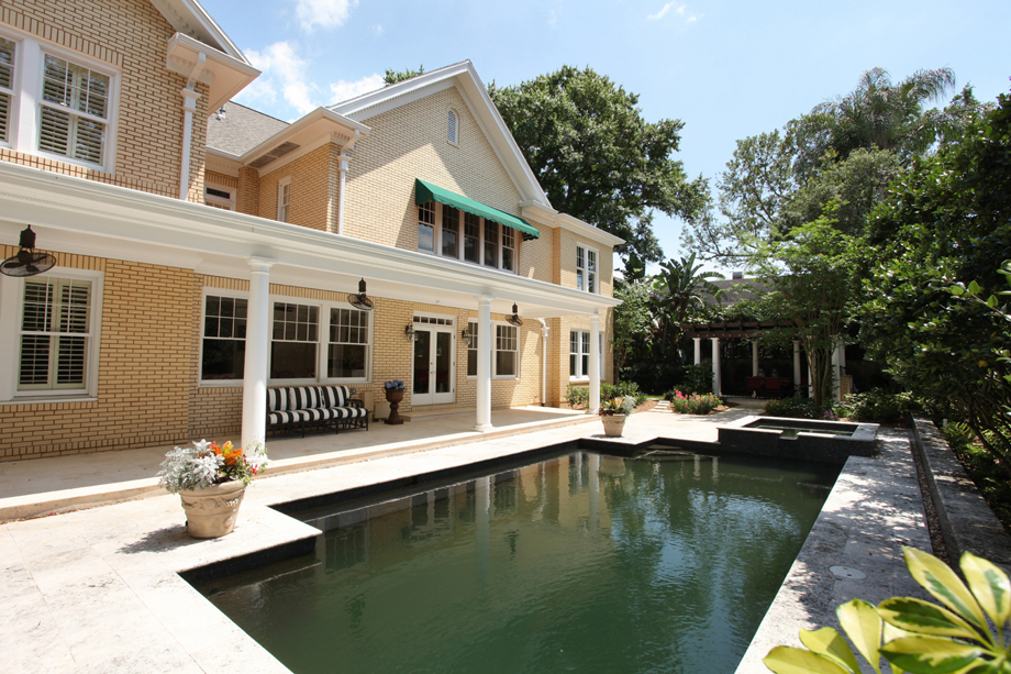
NORTHEAST ELEVATION
BEFORE: The existing second-story master bedroom, top right in this view,
needed more closet space.
AFTER: The 2 new master closet rooms were constructed above the first-story den,
on the far right. Again, seamlessly blended.
WEST ELEVATION
BEFORE: All looks good, just more space is needed.
AFTER: The two-story breakfast/office addition is on the right. The family room build-out
is the lower left, and an additional bedroom is above it. A mix of 3 colors of brick
was used to help the new blend with the old.
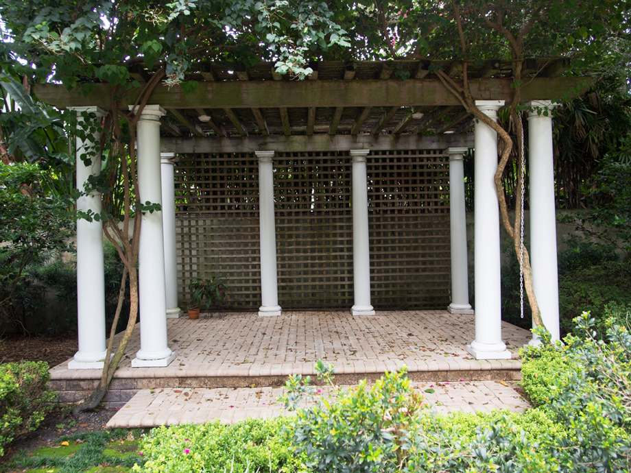
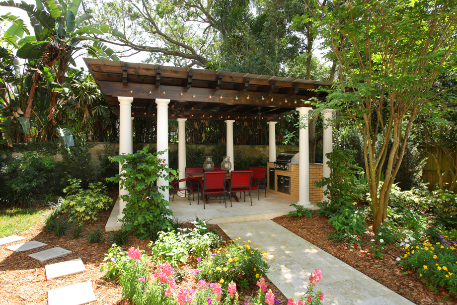
PERGOLA
BEFORE: The structure is a great idea.
It just needed to be moved over a bit…and given a total makeover!
AFTER: Character preserved. Functionality accomplished.
KITCHEN
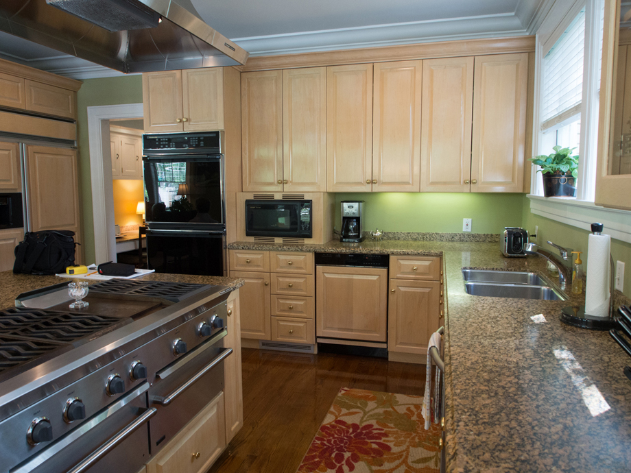
BEFORE: Nice, but not the homeowner’s style.
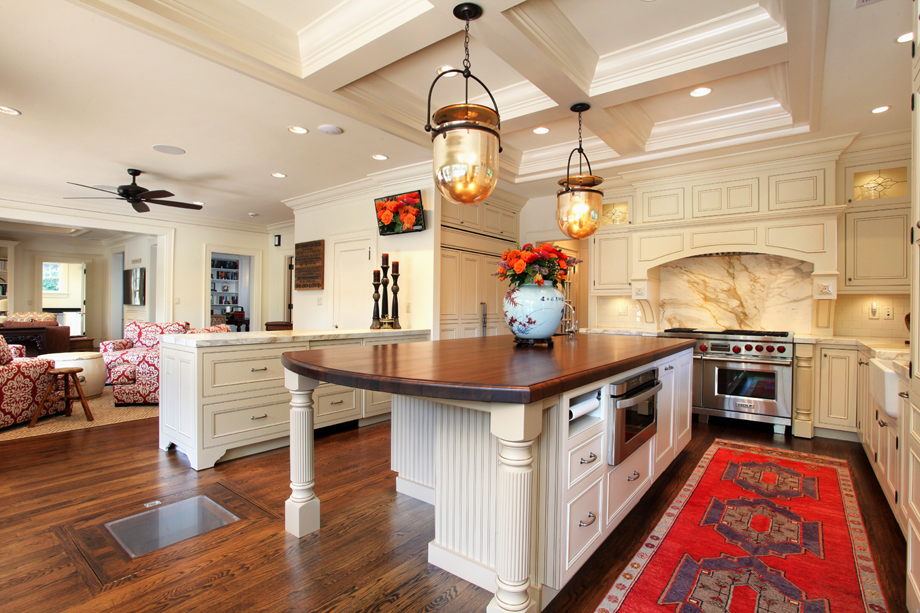
AFTER: Bright, open, new ceiling details, yet still preserving the past.
Notice the trap door in the floor, leads to the original wine cellar!
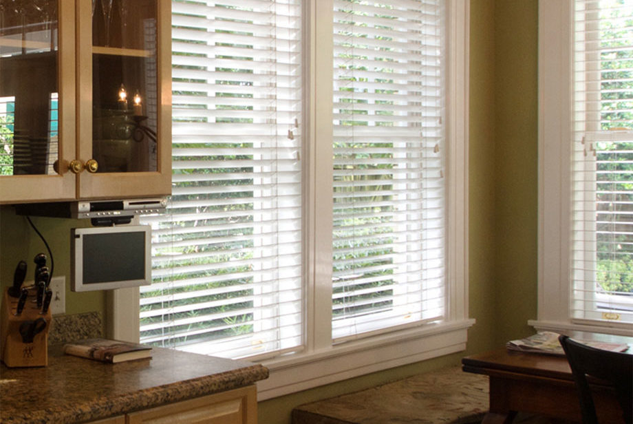
KITCHEN & FAMILY ROOM
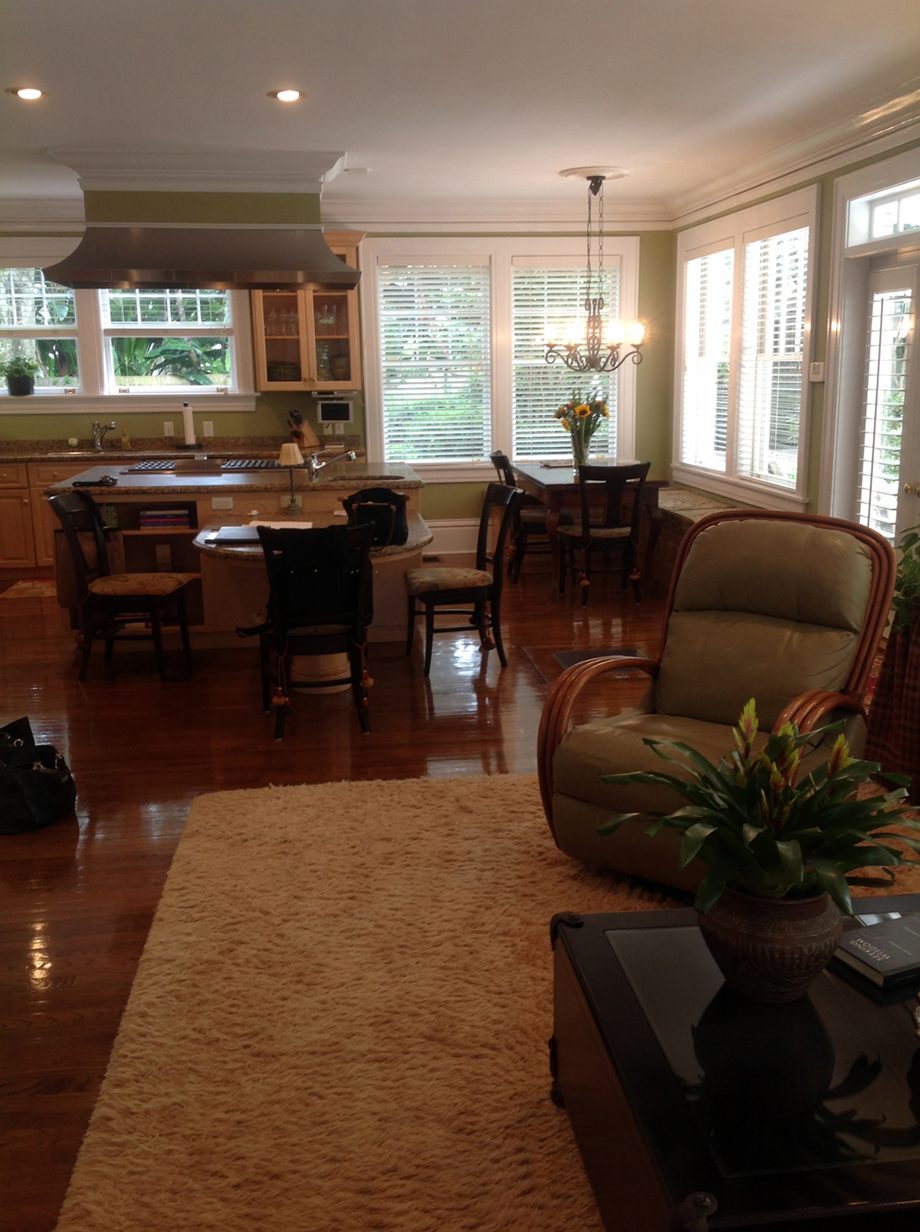
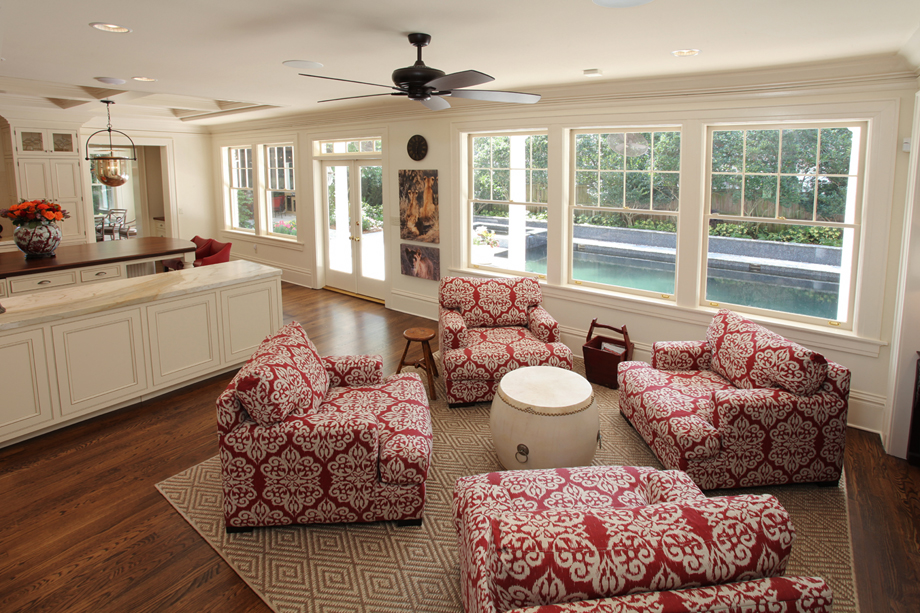
BEFORE: Dark and closed off. Keep and eye on that far window.
AFTER: That window became the vestibule, on the left, leading into the new breakfast room.
BREAKFAST ROOM
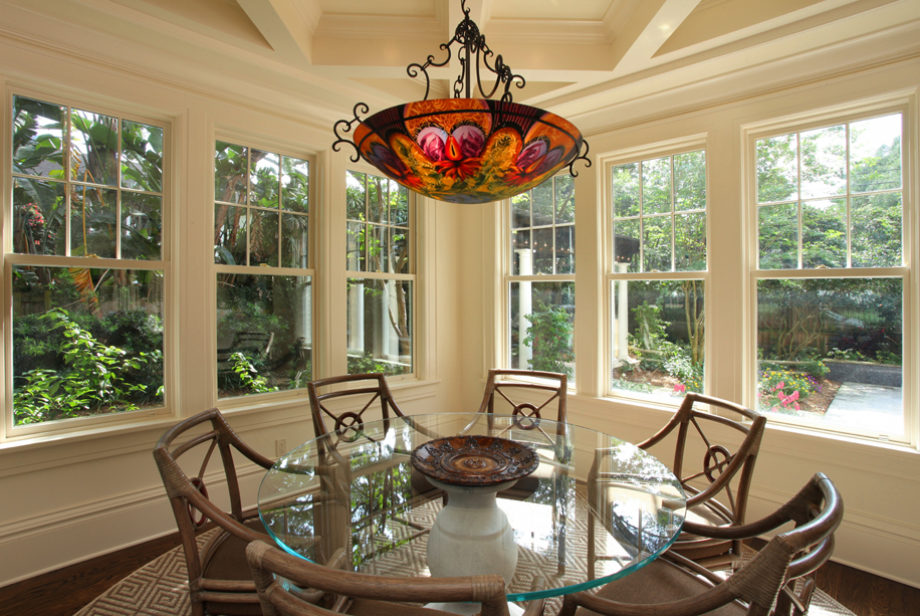
BEFORE: The possibilities for this corner of the kitchen evolved through many inspired meetings…ranging from doing nothing to creating a two-story addition!
AFTER: Addition concept won – down came the walls and 2 stories were added on! Note how the ceiling and window details blend perfectly with the existing home. This gorgeous breakfast room quickly became one of the homeowner’s favorite spaces.
LIVING ROOM
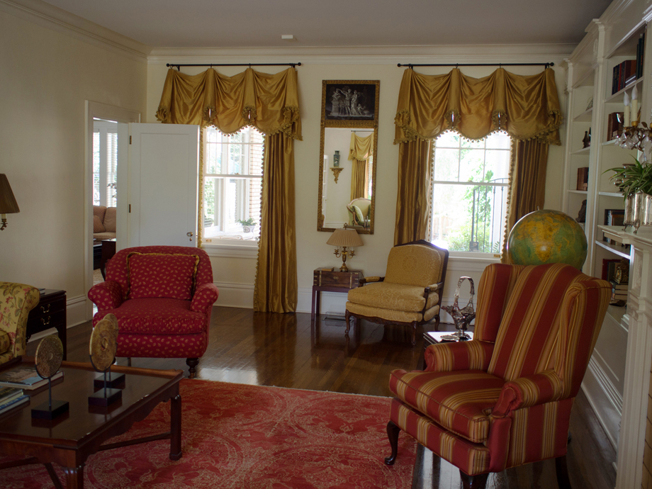
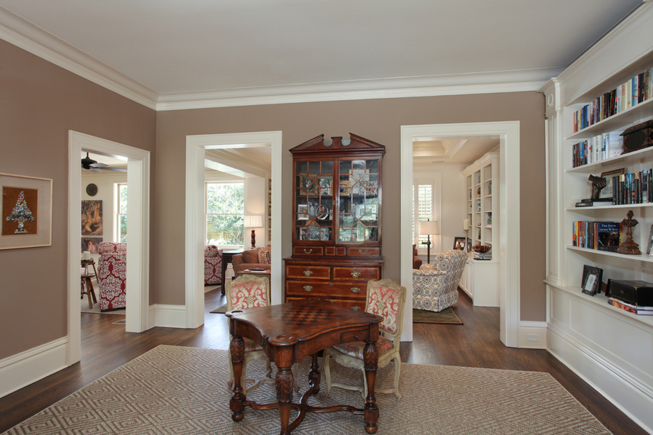
BEFORE: the windows became doors leading to the family room addition.
AFTER: The flow between the rooms is effortless now.
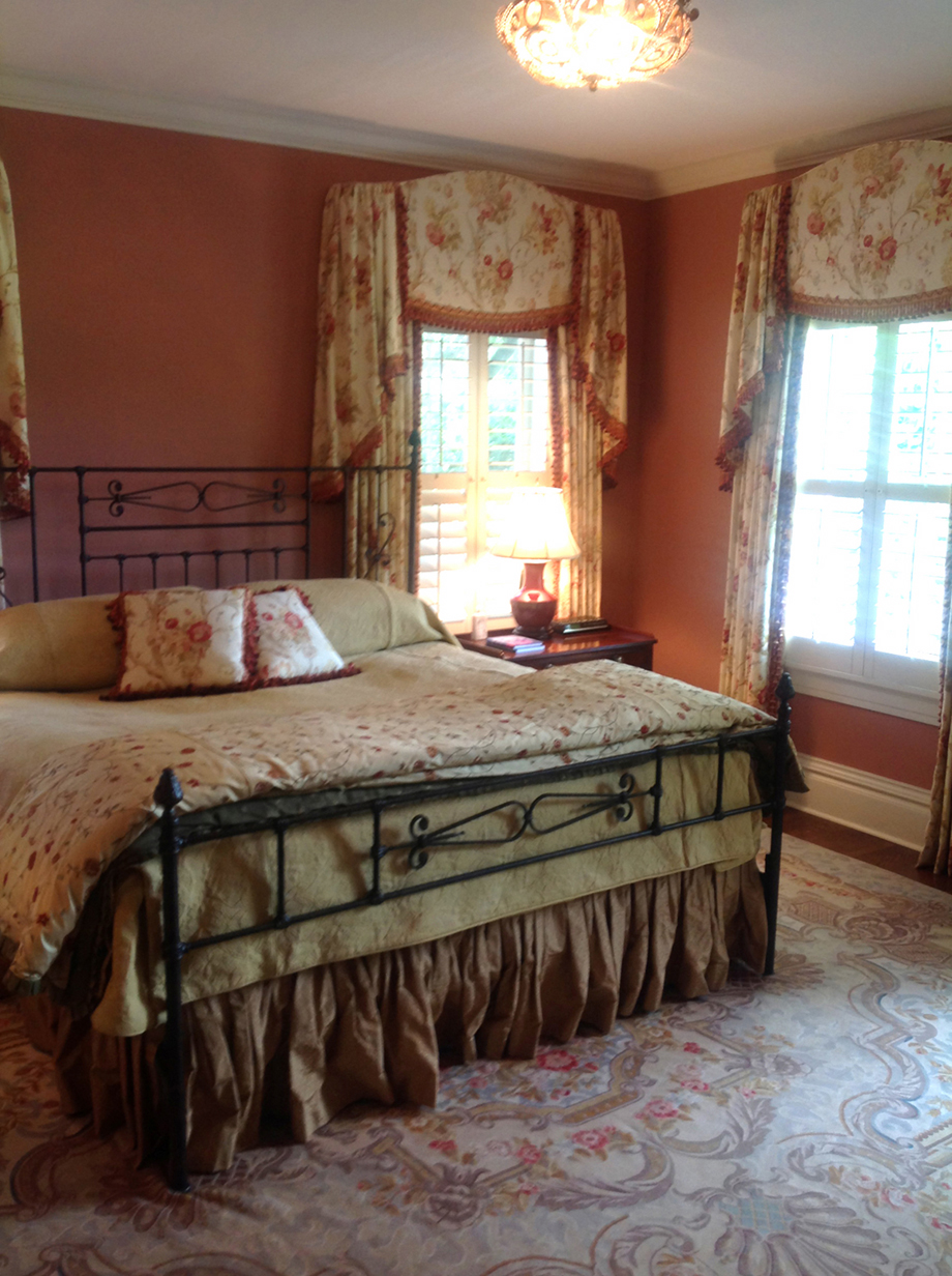
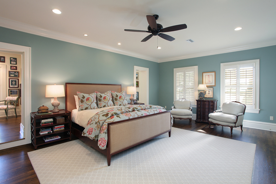
MASTER BEDROOM
BEFORE: The master was small and lacked adequate closet space.
AFTER: A second-story addition provided his and hers walk-through closets,
accessible from either door on the far wall.
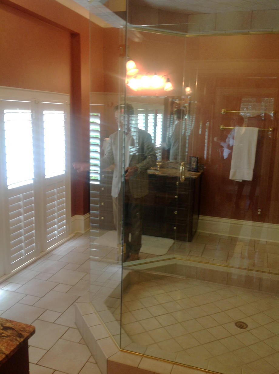
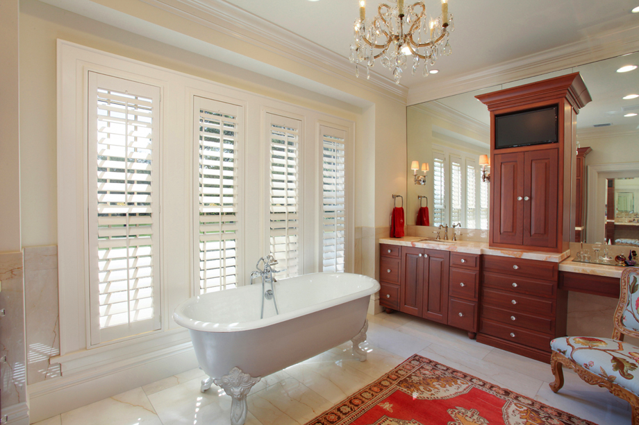
MASTER BATH
BEFORE: You could view the fairways from the middle-of-the-room glass shower.
Problem was the golfers could see you too! Plus the windows sat on the floor
and only went partway up the wall. Very strange.
AFTER: The gaudy shower was banished and the windows raised to their proper height (remember that brick work above the front door?) Elegance and tranquility everywhere.
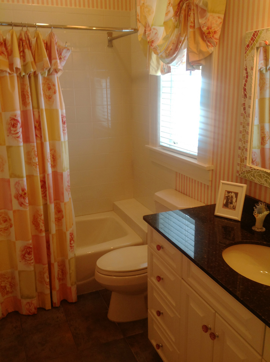
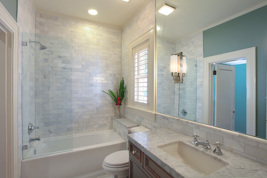
HALL BATHROOM
BEFORE: Functional, but very dated.
AFTER: Marble subway tile and elegant surfaces
bring this bathroom in line with the tone of the rest of the home.
